.svg)
30 november 2022
It all started with this simple question: Can we add more links to the menu? This came from the SEO manager that wanted to experiment with more links in the menu to achieve better search engine ranking.
It sounds like a straightforward request but it is an excellent example of a simple question that can trigger an extensive redesign that impacts how users experience a website. It can also lead to many discussions requiring business decisions so brace yourself for the ride.
In this article, I will explain what are the steps you can follow to redesign an existing feature and how I ended up choosing a design direction that does not look at first glance as the user’s first choice but makes sense as a business decision.
More specifically I am going to lay out:
- What is global navigation, aka the main menu, and why it is important.
- What is the failsafe process you can follow to redesign an existing feature and what were my challenges on each step.
- What is information architecture, how it is connected to global navigation and how we redesigned it.
- What you can do as next steps once a new feature is released.
But first things first, what is global navigation?
A global navigation is a region of the user interface that appears consistently on all the pages and is reserved for buttons, links, search bars, or any other design element affording movement from one set of content to another.[1] It is the main way to tell your users what the site is about– no matter where they came from, and can provide a glimpse of the site information hierarchy.

Randstad.nl global navigation
It is well established that users are so impatient on the internet that they don’t take time to learn about any individual website and its information hierarchy. They are incredibly task-driven and get frustrated fast if they don’t find what they are looking for. These frustrations often result in them proceeding to the next site. [2]
This highlights the importance of striving for a well-designed global navigation with an information hierarchy that makes sense to the user.
The process
The global navigation was redesigned following the double diamond approach. This widely known framework takes you from a problem to a solution following the steps of discovery, definition, exploration and execution. [3]
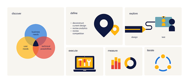
Discovery: Why are we doing this?
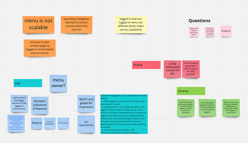
The first step was to build a shared understanding on the why of this initiative and scope it. I did this by speaking with the stakeholders and gathering their thoughts and wishes. I spoke with stakeholders from all the teams that would be affected representing business tech and design. I also reviewed past user research we had done on navigation in both web and mobile apps to get the user’s perspective.
Challenge: This part of the road is tricky, you need to gather all the information impartially and not give more weight to one opinion over another. Be critical of the input. In the end you need to filter out the important bits you will focus on.
I continued with a deconstruction of the current menu, which was a legacy design from our last rebranding. I examined how it worked, the design decisions behind it and compared it with navigations from both competitors as well as the other labels within the Randstad company.
Definition: what is wrong with our current global navigation
The key pain points and opportunities for improvement I discovered came down to: scalability, usability and accessibility, mobile navigation, inconsistency and inefficiency. But let me elaborate on these to give some clarity.
Scalability & SEO optimisation
We needed to improve our search engine ranking and get more page visits.
The global navigation was not scalable. There was a finite amount of menu items that fit under the primary sections in the top navigation bar.
Opportunity: We can create a scalable design with more space for links
Usability and accessibility
We had interaction problems like accidentally triggering the hover effect of the section next to the one you were exploring and thus challenging the user’s motor skills. Moreover, the global navigation changes colour to match the header colour of the page and this presents some accessibility issues due to the fact that the colour contrast between text and background was not always strong enough.
Opportunity: We can improve the usability by having more space the user can navigate in and introducing delays so that the user does not accidentally trigger hover effects without wanting to. We can improve legibility by presenting all the navigation options on a light background with dark blue typography regardless of the page header background, thus increasing the colour contrast.
Mobile navigation
The mobile navigation design was a list of collapsible links that the user needed to click through to discover the second layer of navigation. We already knew that the users preferred to see what their options were in one glance even though it meant scrolling more on mobile. On top of that the logged in environment navigation worked differently than the public one.
Opportunity: We can create a design that gives a better overview of the options available and is consistent in both logged in and public environments.
Non consistent user experience
Not all links from the public environment were available in the logged-in environment.
Opportunity: We can improve the information architecture and introduce more links in the logged in environment that are relevant to the users which they could not access before unless they logged out.
Efficiency
We had two different implementations of the global navigation and two teams maintaining it.
Opportunity: We can build one solution that is going to be used for both public and logged in domains. This way we will not need two product teams maintaining it and we can have more control of the feature and the content displayed.
Challenge: At this point of the journey you have your foot firmly on the gas and want to tackle all the pain points. Take a step back and evaluate, what is the value versus effort for these. Be transparent by sharing the information you gathered with your stakeholders. Decide together on priorities. What is a must have and what is nice to have?
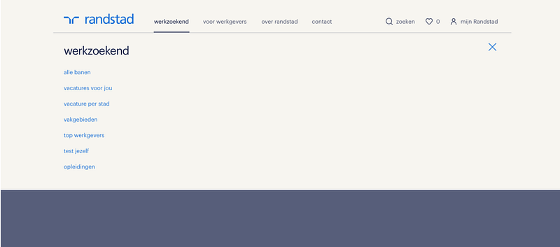
Explore: Design exploration and testing time
After several office-chair yoga sessions, cups of coffee and creativity-inducing lunch walks where I contemplated what I knew up to this point, I started sketching and settled on two directions: a split navigation solution and an all-inclusive top navigation solution. The first solution groups the logged-in environment links in a sidebar while placing public content links in the top bar. The sidebar was only visible once the user accessed the logged-in environment. In the second version both logged-in and public domain content was placed in the top navigation and was accessible through a big drop down. Both solutions answered the set of requirements so it was up to the users to decide which worked best for them.
Split top and side navigation (left), top navigation only (right)
Challenge: It is easy to get carried away with experimental designs and solutions at this stage. Try to not reinvent the wheel. A global navigation is a very specific thing that utilises established UI patterns, use that to your advantage. The important thing is to come up with something that ticks your requirement boxes even if it does not feel super shiny and new.
Testing:
Brace for humility check: it is testing with users time. For this project we did two consecutive user tests: One to define the design direction (split navigation versus only a top navigation) and another one to focus on the menu content structure. During the tests, we asked participants to find where they could do a specific action such as filling in hours, finding interesting vacancies, finding a local Randstad office, updating their CV or finding the status of their applications.
1st user test: Design direction key insights:
- Users with an account expect to be logged in and see a difference between the logged-in environment and the public website
- Speed and accuracy are most important when navigating
- The consistency of the menu between app and web is important, because it creates a sense of familiarity.
- The split menu received more positive feedback, and should be considered as the most favourable of the two menu options; important aspects being: clarity, speed and accuracy and similarity with the menu in the app
Challenge: From this test the conclusion at first glance was that the split menu was the users choice. What is interesting to note is that we did not choose to go that way rather we continued with the top navigation only design direction. And here is why:
Our user sample during the test consisted mostly of people who had a randstad account and some of them were using the mobile app for their administration. Their first action was to log in, hinting that they may only be interested in personalised content. Having a clear separation between logged in and logged out content, provided them with a list of navigational links that was relevant to them as logged in users. Which left us with the question, did the participants prefer the split menu because of the overview, or the separation of logged in and logged out information? On top of that the side menu resembled that app flyout menu look and feel which was familiar to them and they tended to prefer what they were used to.
Another aspect that led us to pursue the top navigation only solution was the value versus effort argument. Building a sidebar meant we needed to change the grid of the whole website which would have a huge impact on individual components and pages. This meant a lot of work which translates to cost in resources. The value we would get by this choice was not that great since both solutions seemed to work for the users and ticked the requirement boxes.
2nd User test: menu content structure
In this test the most notable differences between the two prototypes was the position of the ‘Mijn Randstad’ menu, and the account information. The key insights from this test were that:
- Some users could navigate the menu more easily than others, however, there was no reason to believe that the prototype menu would cause significant issues navigating for those who were not as proficient.
- Users expected that they could log out in the first level
- Users expected personalised content when logged in and they preferred to find it on top of the list in the global navigation.
- Mobile navigation test
The tests focused mostly on solving the desktop navigation. However, we did test the existing mobile navigation just to identify if there were any pain points.
We used a hamburger menu on mobile. The main advantage of the hamburger menu on mobile is that it can contain a fairly large number of navigation options in a tiny space and can also easily support submenus if needed; the disadvantage is that it is less discoverable, since, as the old adage says, “out of sight is out of mind.” [4] This has not been a problem that we have observed up to this point and users had no problem discovering and clicking the hamburger icon during research sessions.
The solution:
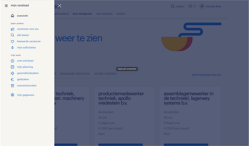
Desktop
The final solution is a big dropdown displaying the title of the section with big bold typography befitting the house style and a vertical list of links that can be clicked when a chevron is next to them and expand horizontally in the next column. This menu can potentially go four layers deep though we will constrain it to three lest it becomes too much of a maze for users.
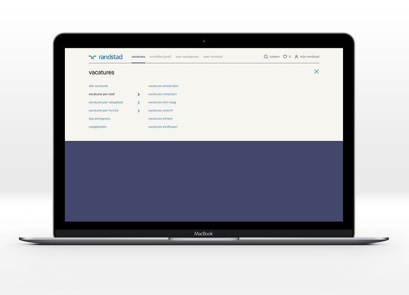
Desktop navigation redesign
Mobile
We used insights from past research done on the Tempo-Team website to make some improvements in the mobile navigation. We observed that users preferred to have a better overview of what is available while scrolling a list instead of having to click through cascading links to reach the content they were looking for. Guided by this insight we chose to have the links visible up to the 2nd layer of navigation. If there is a third layer under the parent link then a chevron is displayed and the user needs to click on it to reveal the content of that layer.. We also chose to add a bottom sheet to help the users access the settings and account menu on mobile devices easier and save some scrolling.
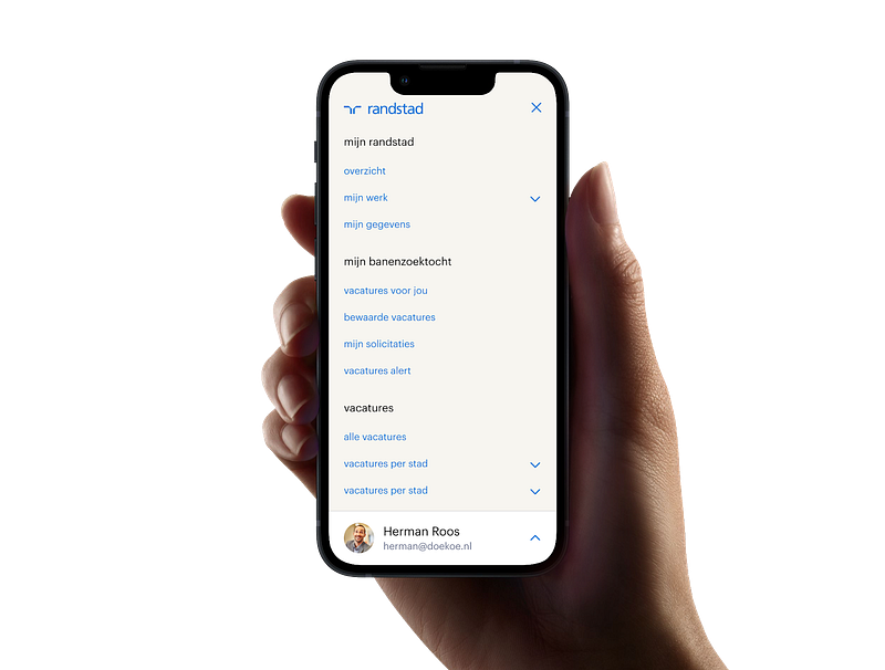
Mobile navigation redesign
Information hierarchy
It should be evident by now that a significant aspect of improving your website’s navigation is the information you display and the order in which you display it. Information hierarchy and navigation are interconnected because it determines whether or not users are successful in finding desired information and completing tasks. You can build the perfect global navigation feature, with intuitive interaction and the cleanest code ever but if the information presented there is not structured in a way that makes sense to your users, they will ignore it and go elsewhere. Maybe even at your competitor’s website.
Challenge: There is a risk when defining the information hierarchy that can lead to a result that does not mirror the way users think. These problems with site information hierarchy can be tied to organisational structure or a company’s internal politics.[6]
Content issues arise when different departments create content without being aware of each other and without following an overarching content strategy. This was one of our challenges as well.
Poor search results may stem from poor content-management systems, flawed or missing tagging of content, or a poor search tool.
So in our case, once the layout and interaction was solved I set out to tackle the information hierarchy. The new menu has more space, it gives us the ability to go up to 3 or even 4 layers deep grouping links under different sections. We were now faced with the challenge of figuring out how to present all the information we have and how to group it under the primary and secondary sections.
I had a lot of talks and interactive sessions to address the best way to get more SEO value from our menu, take all stakeholder’s wishes under consideration and at the same time try not to compromise the user experience.
We did not base our final decisions only on gut feelings, requirements, and business wishes. There was already some past user research to start from. More specific past card sorting research sessions for the logged-in environment content and insights from the latest user tests of the new design. This combined with the collective knowledge and needs of the stakeholders involved led to the redesign of the information hierarchy for both logged-in and public environments.
Next steps: And now?
The new menu MVP is now live on the public and logged-in website and improvements are scheduled for the next sprints. We now have a global navigation where the hierarchy of the pages is visible. This menu reveals the content of our website and is scalable. The answer to the initial question has been given. We have gone above and beyond adding extra space for links to the menu. But is this the end of the ride?
The answer is no, we have released this new design but we now need to see how it performs. We are getting together with the experts to devise a plan on how to measure the performance from both SEO and usability perspectives.
We already see that people are clicking on the top navigation links and expect a landing page that is not there anymore so our next step is to design a solution for that. Any other red flags will be addressed in the future as we monitor the features performance through analytics and the improvement cycle will continue.
Concluding thoughts
We are now at the end of the ride and like every journey it left me with memories and learnings. It was a bumpy ride at times and took longer than I expected and here is what I learned.
Take your time to do the whole process of discovery, definition, exploration and execution.
Don’t skip the discovery phase. Do not rush to the drawing board even if you feel pressure to deliver. When working on an impactful feature you need to make sure you are doing it right.
Be transparent with your stakeholders. Share the information and take them along with you by way of regular updates. Ask for their opinions and be critical of their feedback.
Ask the user what they think they are the ones who will use the feature.
There might come a time when you need to balance user needs with business requirements. This is the world we live in. Try to make the best of it by not compromising on the must haves you have defined.
Enjoy the process and learn from it.
Sources
- https://www.interaction-design.org/literature/article/implement-global-navigation-to-improve-website-usability
- https://www.nngroup.com/articles/is-navigation-useful/
- https://en.wikipedia.org/wiki/Double_Diamond_(design_process_model)
- https://www.nngroup.com/articles/hamburger-menus/
- https://www.nngroup.com/articles/mobile-navigation-patterns/
- https://www.nngroup.com/articles/top-10-ia-mistakes/
- https://uxdesign.cc/how-to-redesign-step-by-step-guide-869379604734